

DMA is a corporate tax firm that came to our agency seeking a full website redesign, with goals to increase client and leadership engagement and better tell value proposition.
Lacking an overarching strategy, I utilized discovery activities and user research to better define and execute DMA’s goals.
I led the project from kickoff through research and UX phases, delivering a discovery findings presentation, taxonomy list, site map, and set of wireframes.
Role
Lead UX Strategist
Type
User Research, Redesign, Taxonomy, Information Architecture, Wireframing
Tools
Google Analytics, Adobe XD, Screaming Frog, Slickplan, Miro, Wordpress
Duration
November 2021 — April 2022
Process

Screenshots from dmainc.com before the redesign:


Kickoff
To prep for the kickoff, I read through the statement of work (SOW), explored DMA’s existing site, and sent around a pre=kickoff survey to the DMA team to start uncovering known problems and goals. I synthesized my pre-kickoff findings and facilitated a two hour interactive workshop with the key stakeholders of the project, including DMA’s C-suite executive team and their internal marketing team.
Workshop activities and conversations were structured around business and project goals, existing challenges, project constraints, key performance indicators, and an in-depth breakdown of DMA’s primary audiences.
The DMA team’s primary concerns were surrounding the outdated UI and content of their site.
Above are the exported Miro boards from the interactive kickoff I prepared and facilitated, showcasing goal setting and persona building activities. The kickoff meeting was two hours long and included all key stakeholders, including DMA’s C-suite executive team.
Discovery
After chatting with the DMA team during kickoff, a lot of initial goals and user needs were outlined, but I still needed to hear from the users themselves. To dive into the research, I structured a thorough discovery process, aiming to fully unveil primary users’ needs behind DMA’s site redesign.
Analytics Audit:
I worked with a member of our marketing team to utilize Google Analytics to filter out bot traffic and analyze key awareness and engagement metrics for DMA’s site over the past 12 months, identifying trends and areas for improvement.

Competitor Analysis:
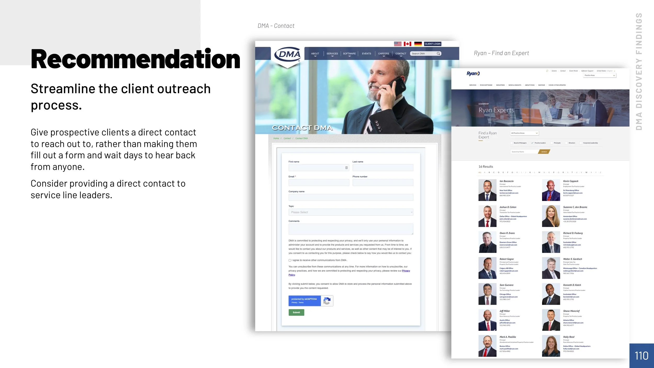
I closely looked at three of DMA’s competitors (Ernst & Young, PwC, and Ryan) and evaluated their websites on navigation, clear calls to actions, user support, and mobile layouts, making recommendations on how to leverage what others have done to uniquely position DMA for greater success.
Stakeholder Interviews:
After screening participants, I selected three of DMA’s recently hired employees and interviewed them each for 45 minutes.
I got a chance to ask them about their experience discovering DMA, their first impressions of the company, and how they used the website throughout the hiring process.


Focus Group:
I also led a focus group with six of DMA’s executive team where I was able to gain valuable insight on the direction of the company and how that can be portrayed through the redesign.
User Research Survey:
I sent out and posted a survey on DMA’s website, asking users about their experience with the existing website.
The survey asked users to report things like what user group they belong to, what sections they visit on the site, if they experienced any issues with navigation, and to rate the overall design and experience of the site.
Though the survey only had 14 responses, I was able to pool the data into my larger research and move forward with findings and recommendations.
Key Findings
After analyzing both the qualitative and the quantitative research from the discovery process, I was able to formulate key findings and present them to the DMA team as a part of the discovery findings presentation.
DMA’s people and company culture are what make them standout.
DMA’s employee owned company structure is reflected in all they do, but their website doesn’t convey this.
Users have a hard time understanding who DMA is from the website.
New hires had a difficult time getting to know DMA since the website is devoid of relevant clients, case studies, and company culture.
DMA’s service and software offerings are not clear.
DMA’s service offerings use internal jargon and lack industry specific information.
Prospective hires wish DMA’s employee benefits were clearly outlined.
DMA’s benefits are what draw prospective hires to them, but users are having to turn to external job sites like Glassdoor to learn about them, since they were not clearly listed on the website.
The website content and DMA brand is outdated.
Newly hired employees at DMA said they were surprised to find out the DMA works with larger clients when they started. Survey responses reiterated this, as the visual design of the site only scored a 2.3 (out of 5).
The site navigation is confusing to users.
As seen in our survey findings, the majority of respondents couldn’t find what they were looking for or had a hard time using the navigation menu. In some primary navigation items, there were 11 secondary pages in the navigation. Users are missing content simply from information overload.
Defining User Personas
I identified DMA’s three main audience groups as prospective hires, prospective clients, and existing clients.
Creating personas helps designers better understand users' needs, experiences, behaviors and goals, so that we are designing without preconceived assumptions.
Discovery Recommendations
After reviewing all discovery findings and defining DMA’s key audience groups, I created a detailed list of 14 recommendations that directly map back to the project goals, creating a strategy for success. These recommendations were presented during the two hour discovery findings presentation meeting.
They can be summarized as:
Buildout DMA’s narrative with interactive features and animation to reduce text heavy pages.
Highlight how DMA is different and update tagline to reflect this.
Design a new navigation menu, revisiting the structure of DMA’s services.
Add more case studies, insights, testimonials, and career content to the site.


Information Architecture
Content Audit:
Before drafting a new site map, it’s important to do a site crawl and evaluate the structure of all the site’s URLs.
After crawling the site with ScreamingFrog, I put together a content audit spreadsheet to compile all the site URLs, organized by site section and worked with the client to mark pages as Keep, Delete, or Merge.
Card Sort:
Once the content audit was complete, I moved the pages marked as Keep and Merge into Slickplan, as well as added new pages.
I held a two hour card sorting meeting with DMA’s team, facilitating the restructuring of I.A.
The new site map prioritized new content on careers, service lines, and industries.
Taxonomy:
With a new site structure and content, it is important to restructure the site’s taxonomy to reflect it.
I created a taxonomy spreadsheet with a proposed list of categories and tags, then held an hour long meeting with DMA’s team to review it.
After a few modifications, the taxonomy list was finalized and I was cleared to move on to wireframing.
Wireframe
The client was only scoped for 5 wireframes so I had to be strategic with what I created, focusing on reusable components.
As I wireframed the pages I prioritized content according to my user research findings and created new components to meet the needs of the users.

A Homepage with Strategic Content Hierarchy
Hearing that most users did not know who DMA was or what they did, I prioritized components in the hero to showcase DMA’s service offerings and expertise.
The narrative builds as users move down the page, learning more about the clients DMA works with and how to join the team.

Expertise Area Pages to Cohesively Group Service Offerings
I recommended restructuring the way DMA presents their service offerings to show how they can be packaged, while making DMA’s capabilities more easily understood by new users.
The proposed expertise areas were Audit & Recovery, Advisory, Compliance, Audit, and Technology & Software.

A Revised Nav. Menu
To accommodate the new information architecture, I designed a more dynamic navigation menu, which exposes third level pages.
The menu allows for site managers to highlight featured pages, like their new Transaction Tax 360 offering.

A Reinvented Careers Landing Page
Since prospective hires were outsourcing to GlassDoor and Google for more info on careers at DMA, I made sure to include the highly sought out content on this page.
The page promotes DMA’s company culture with videos and testimonials of their employees. It clearly outlines DMA’s benefits, highlighting the often overlooked stock ownership program. It even has a new integration with DMA’s job site that allows the site manager to seamlessly feature job postings.

A Place to Showcase Thought Leadership
Publishing relevant news and insights is integral to owning an active voice in the Tax Consulting space and building trust in clients, so I created a more cohesive and filterable News & Insights listing page.
We reminded the DMA team that frequent publication of blogs, white papers, and articles not only showcases their expertise, but can greatly enhance SEO.
Exports of the finalized wireframe package. Pages were templatized to meet budget constraints.
Visual Design
Creative Kickoff:
The visual designer on the project, Drew Ellis, reviewed my discovery findings, IA, and wireframes, then put together a creative kickoff with the client to gain further insight on the creative direction of the project.
Mockups:
Next, I worked closely with the visual designer to ensure all aspects of the wireframes would be captured in the sites visual design.
My team delivered 5 page mockups, a mobile homepage design, mobile menu, along with a style guide and messaging guide for DMA.
Mobile Designs:
Style Guide:
Animations

Sample of the homepage animations.
I conveyed this homepage concept to the visual designer as a strategy to combat the confusion surrounding who DMA is and what they offer. I also suggested showcasing the faces of DMA with some B-roll imagery in the background to give the site a more friendly and personable feel upon a users initial landing on the homepage.
Handoff
I worked with the Project Manager and Tech Lead to put together a build spec for the redesign, ensuring that all new features, components, and specs were documented. The project went into development in May 2022 and went live in August 2022. Be sure to check out the finished product at dmainc.com!